
Doxo, INC, one of the largest bill-pay and financial services tools available free and for a small $5 monthly ID theft insurance policy, automated free payments using any method of your choice, and a lot of other awesome potential products to come.

Create an atomic or modular component library that is shared across designers, marketers, developers, and with this a standard for the user experience and trust level for a heavily saturated fin tech industry with a low budget, and lots of changing technical issues along the way.

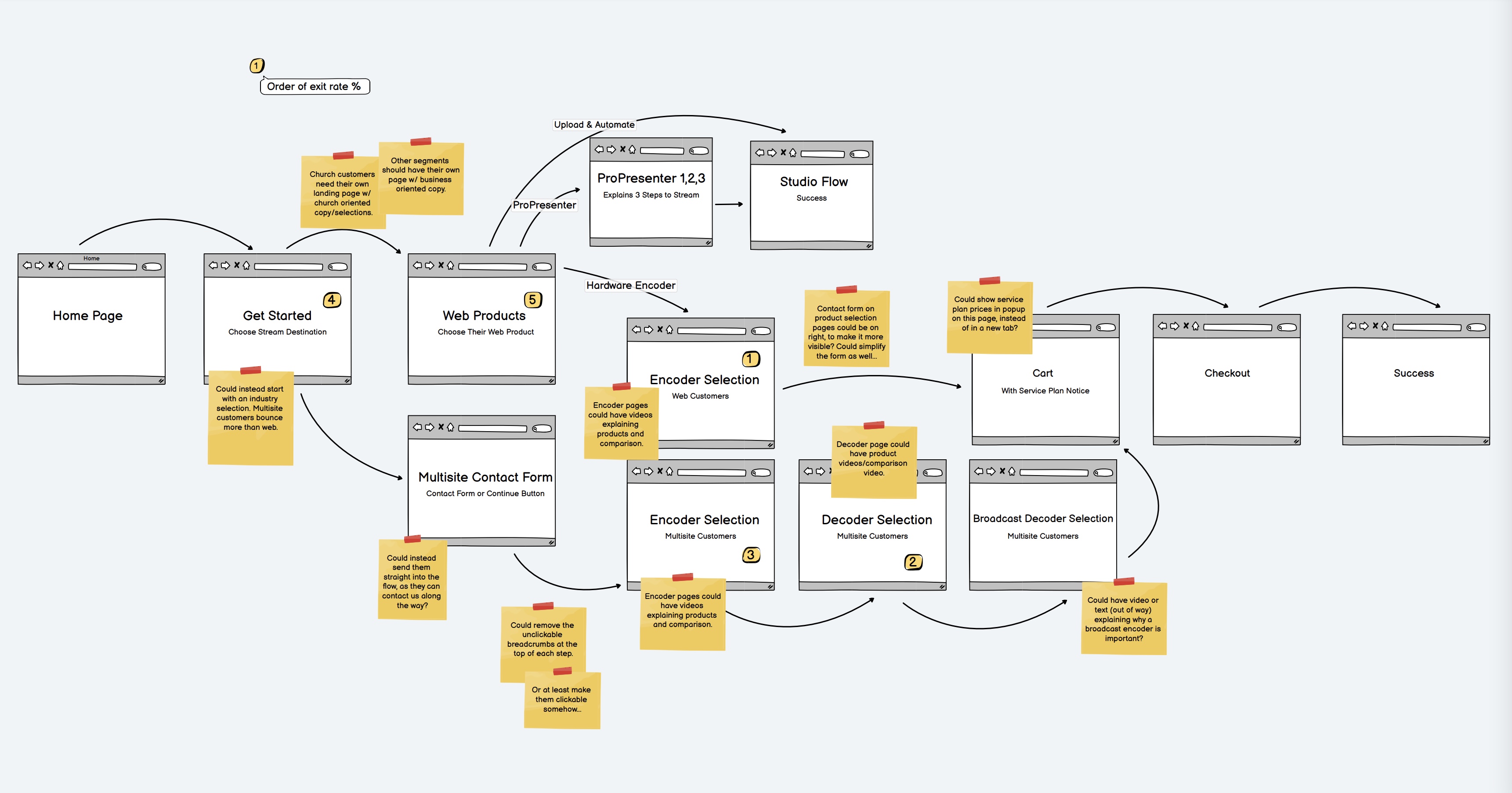
The lack of beta or process groups meant most of the UX research would have to be done with family, friends, people in our demographic who had not yet used Doxo. It turned out there was not a lot of positives from the very beginning. There were lots of questions (which I try my best not to answer unless we get stuck completely) with the user asking why the button wasn’t underlined as it was on the last screen, or some other very easily fixable sort of common sense that made the entire process take a step backward. After 18 interviews with target users I found that there was not a single part of the onboarding flow in which a single user was able to understand what they bought, why, and what they needed to do next step to get all there bills in the application.
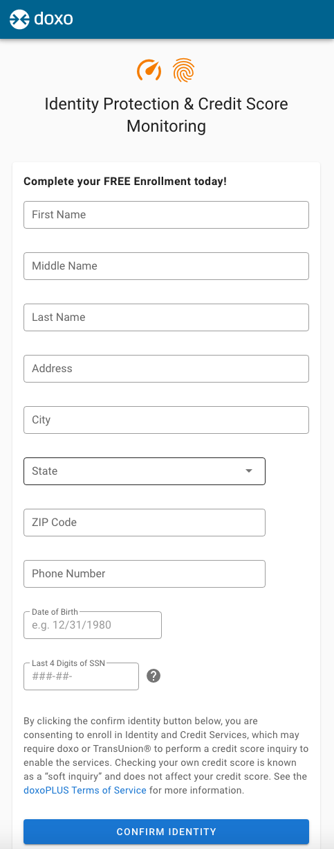
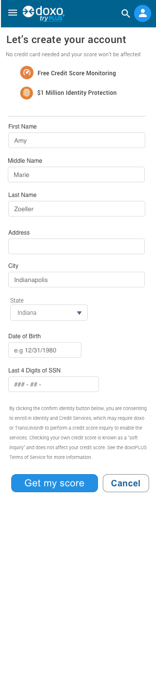

Simplicity, easy to understand benefits for doxoPLUS, and an overall verified review using a trust platform showing users are getting a lot of of doxo. These reviews or testimonials or case studies go a very long way to getting someone to sign up for such a great deal for credit, identity theft protection, overdraft protection, and much more. For less than a cup of coffee per month it is truly the best financial tech deal out there today.
Limited in scope as this was not able to get into a beta test period. Overall our user testing was limited internally and within close friends for their input based on their experience with similar projects under NDA’s.
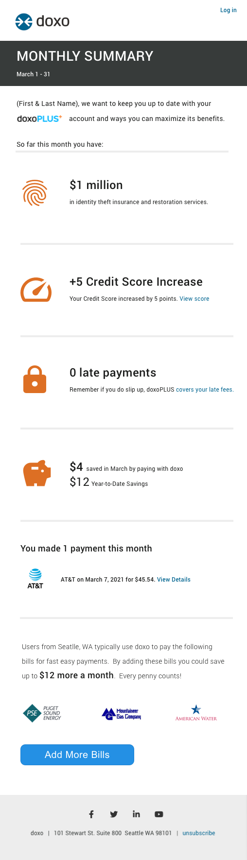
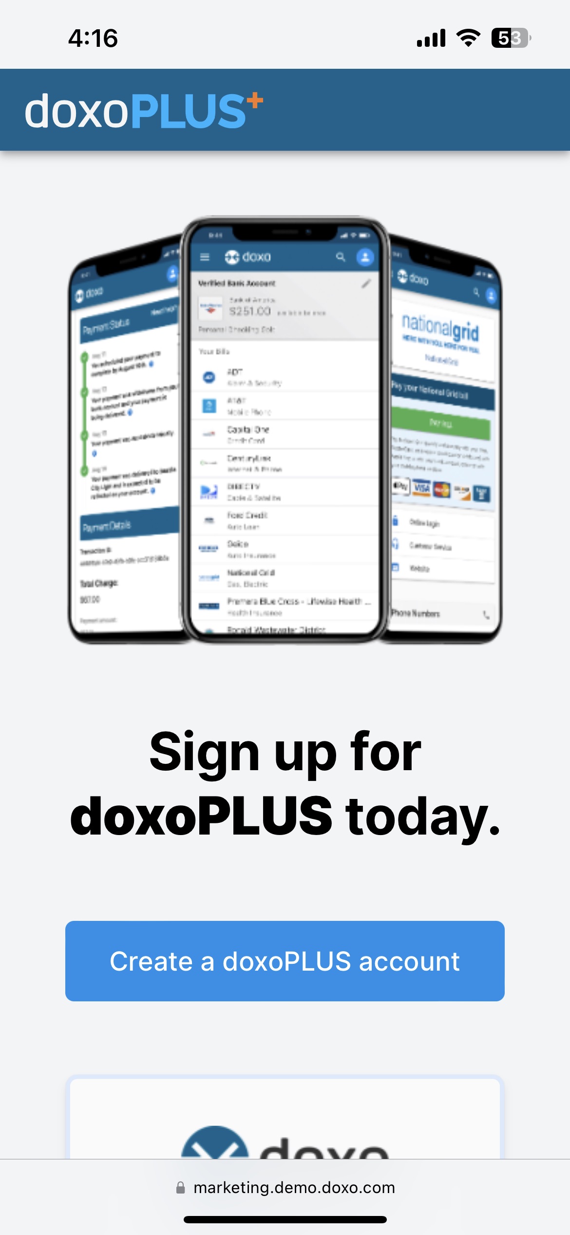
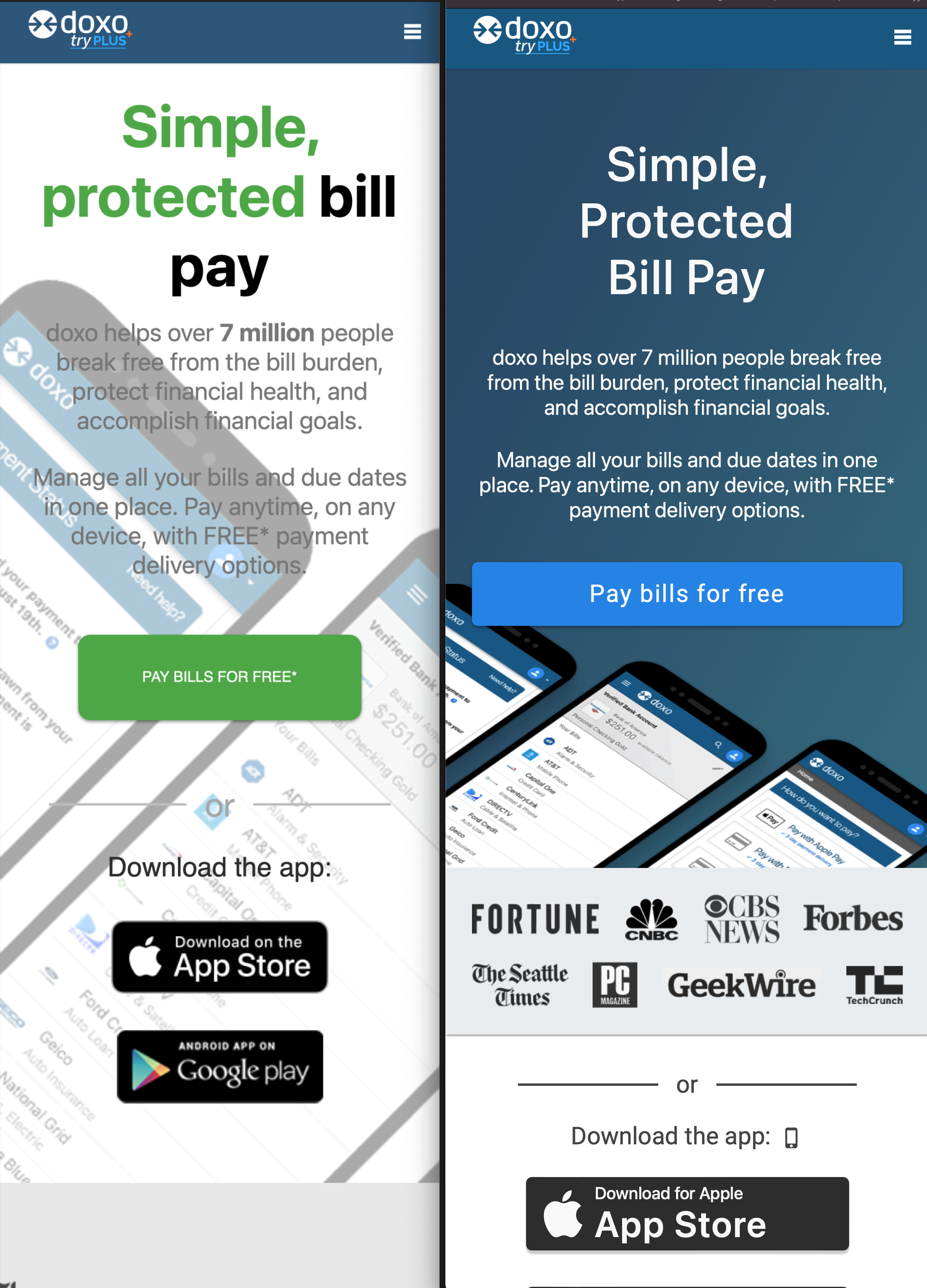
Overall this page ended up as a huge success over the previous homepage, enough so that we pushed our paid traffic to it and are working towards an overall rebrand based on this for our paid landing direct marketing pages.


.svg)