
Resi is a streaming provider that offers world class streaming with zero buffering or packet loss. They mainly serve churches and houses of worship, but have started to grow into the corporate and event-streaming space as of the past year.

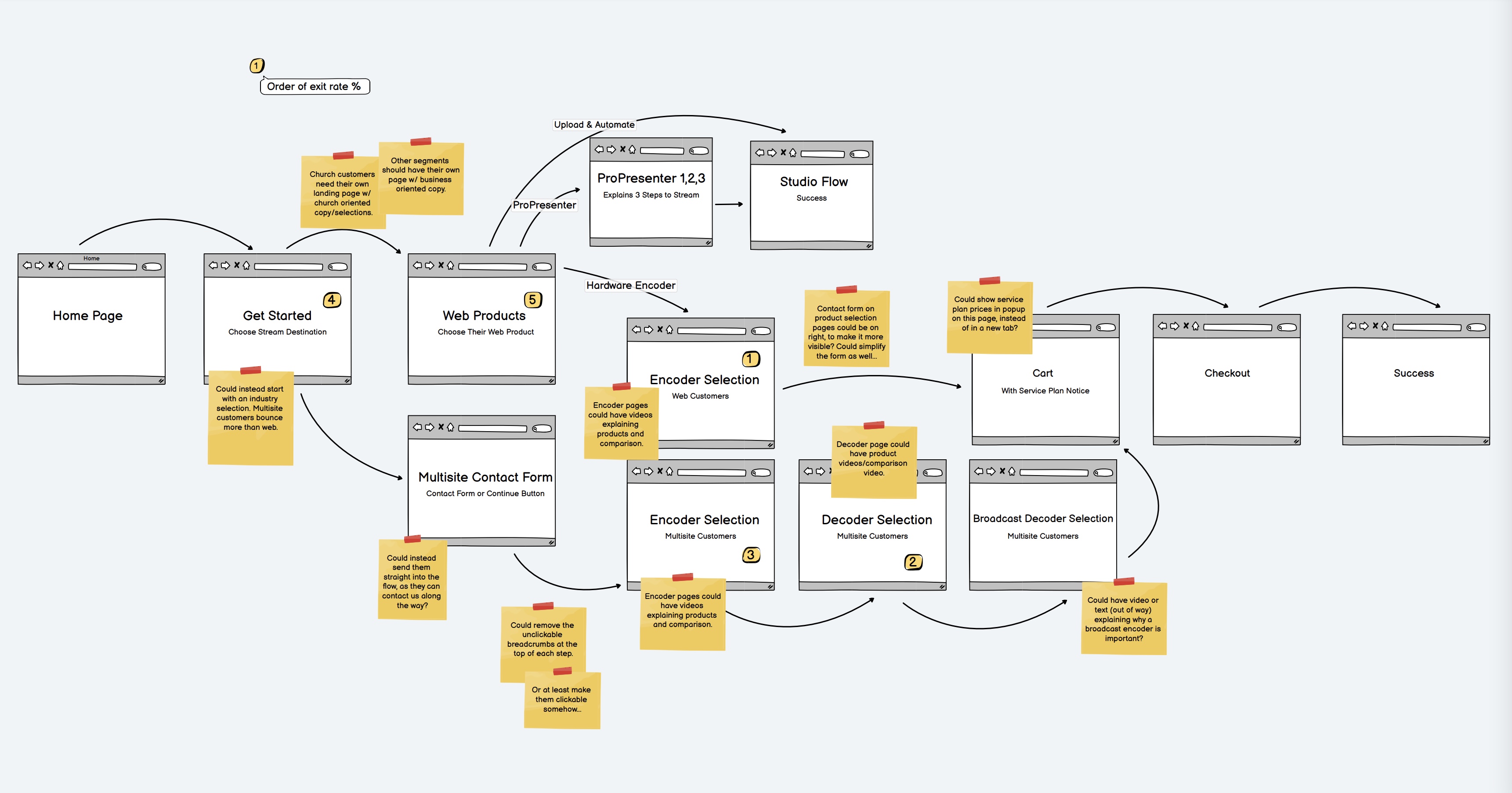
Resi's flow for getting a new customer started from their website was struggling to convert. Users would get about halfway through the flow before abandoning, as they often times did not seem to understand what each product was or if the option was 'right for them'. The most important part of the funnel is making sure users understand they will be able to use Resi's product for their use case, which on launch was never brought into the design of the screens during the first half of the flow. User abandonment was simply too high, so something had to be done about it.

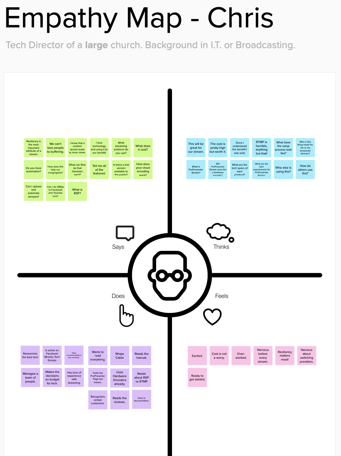
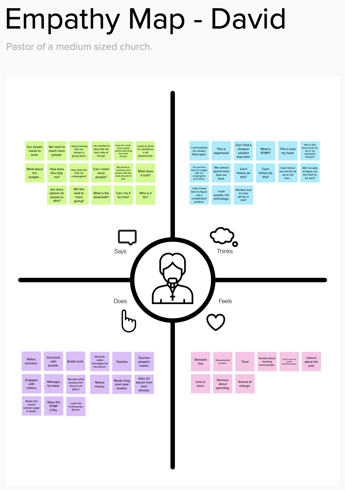
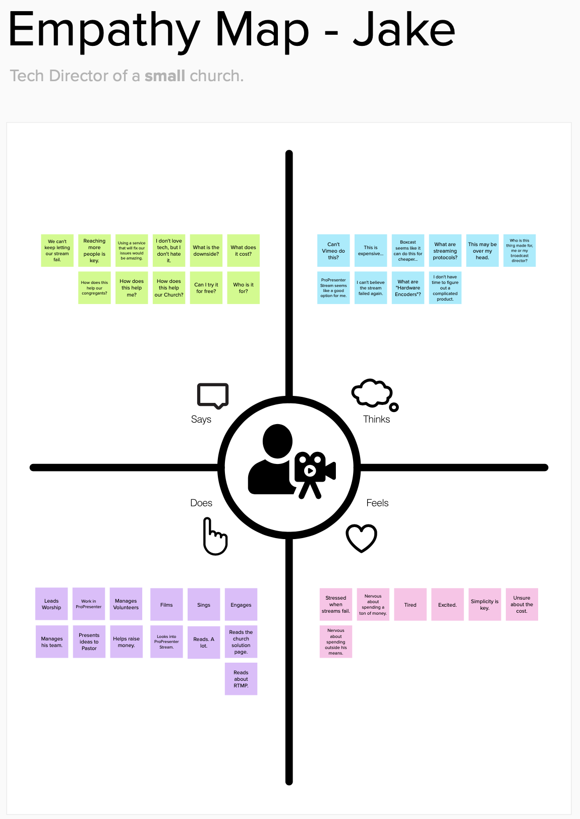
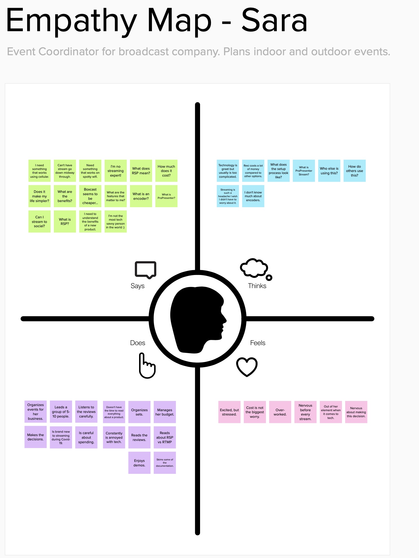
We developed 4 user personas based on Resi's current customer demographics. Chris, the high-budget large church broadcast director who wants the best of the best regardless of price. David, the pastor of a small-medium sized church simply looking for a better stream for a low cost. Jake, the medium sized church tech guy who often times balances multiple jobs at once, who is mainly looking for something that simplifies his life. And Sara, the event coordinator for a large event company who has plenty of money to spend but isn't familiar with much of the terminology or products offered by Resi. We found 4 users that fit closely within these personas, and ran a user journey session for each to find out where the main pain points where and identify any areas of opportunity to improve the user's experience at any point from start to finish.
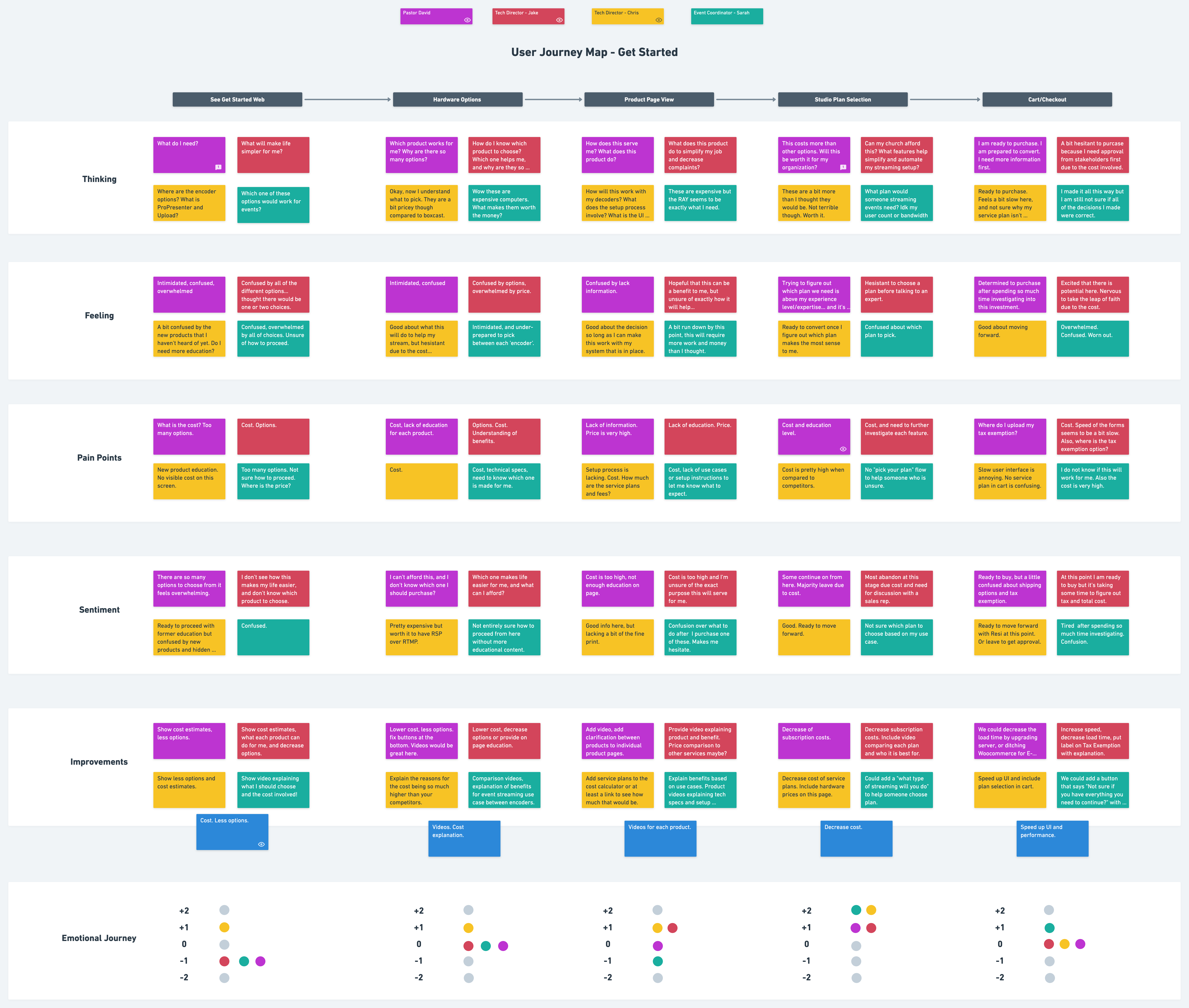

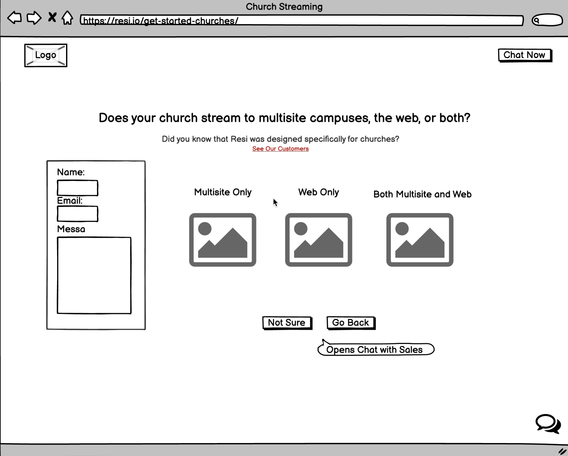
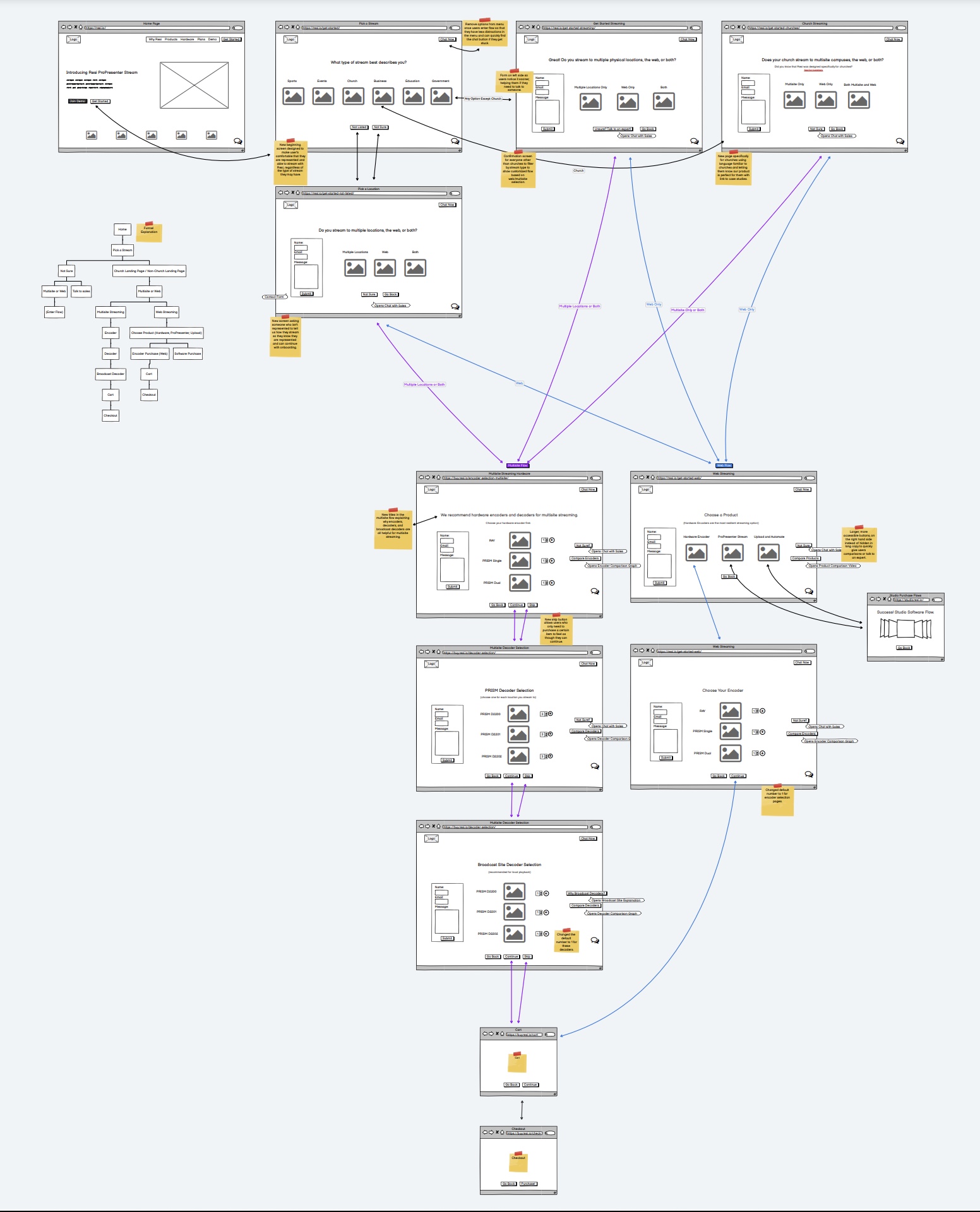
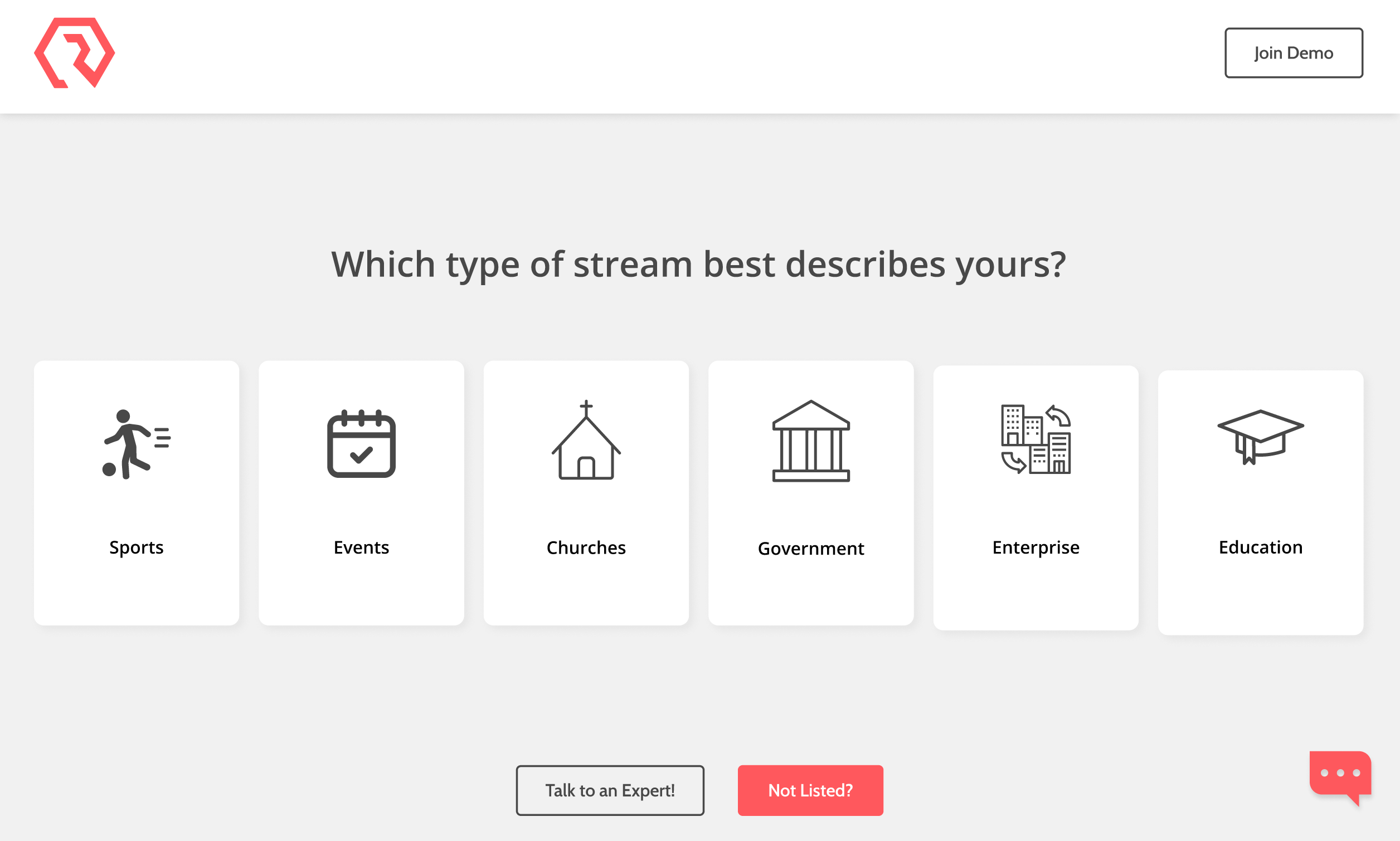
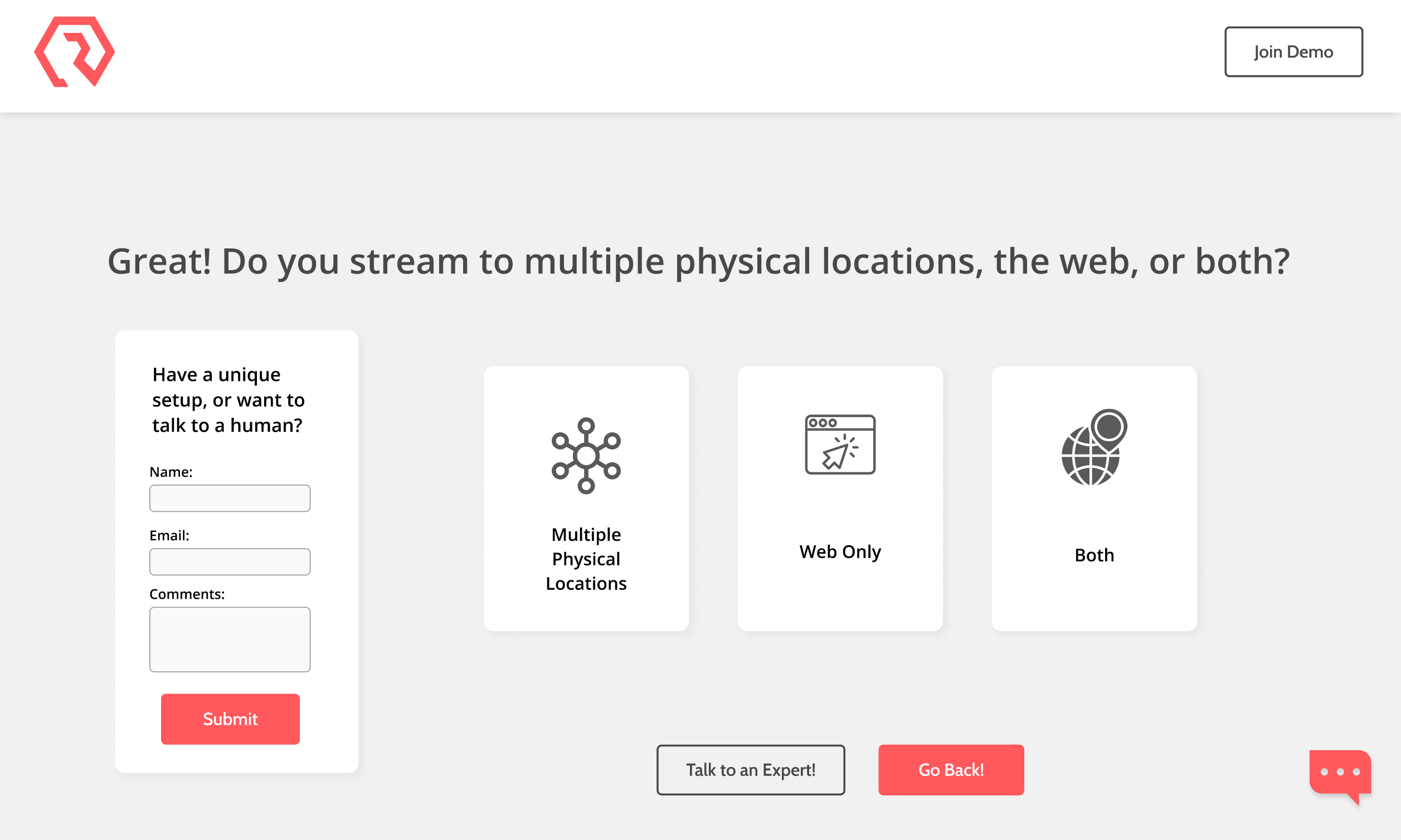
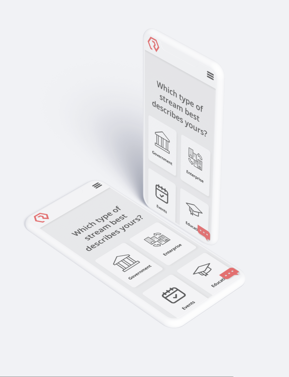
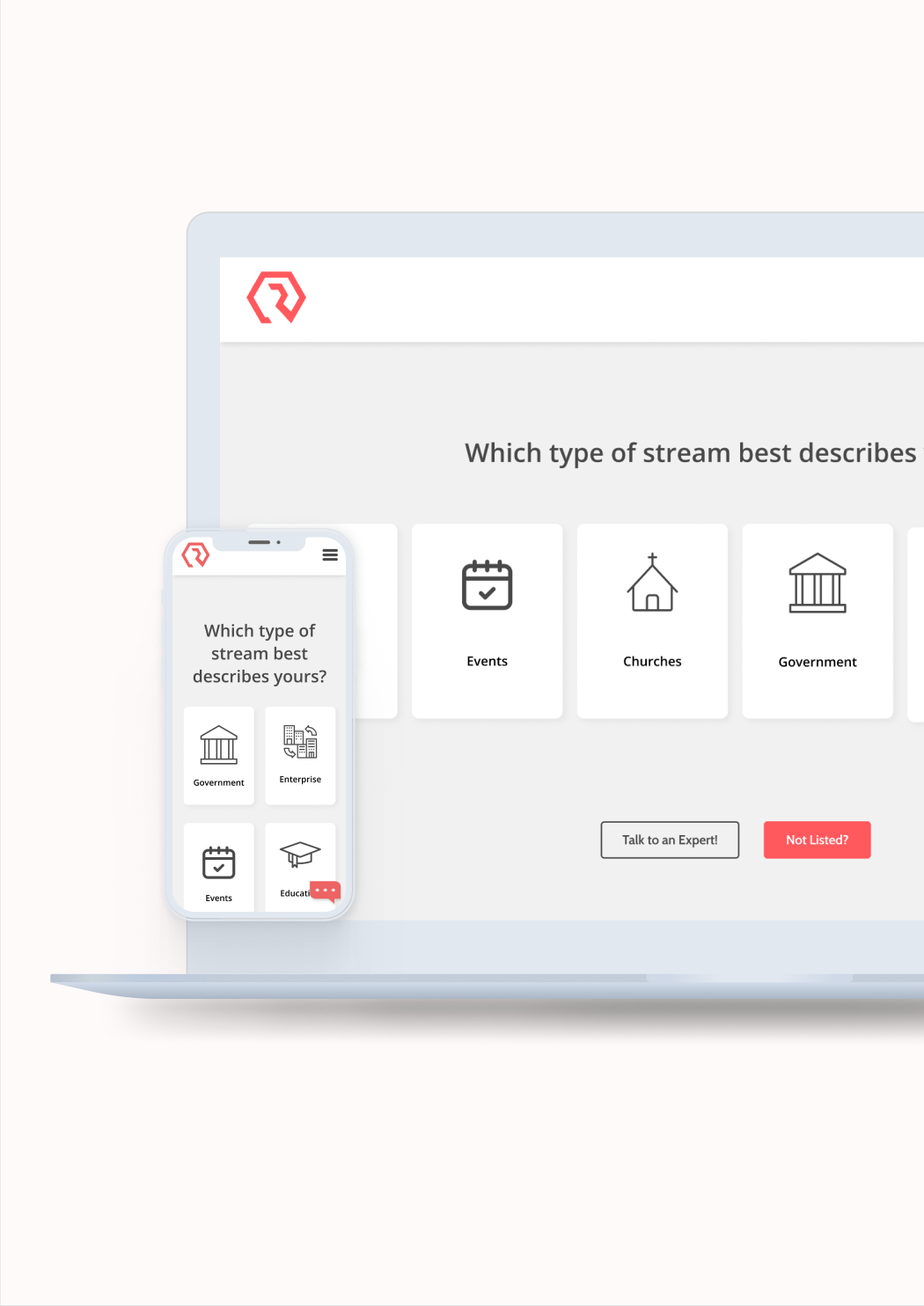
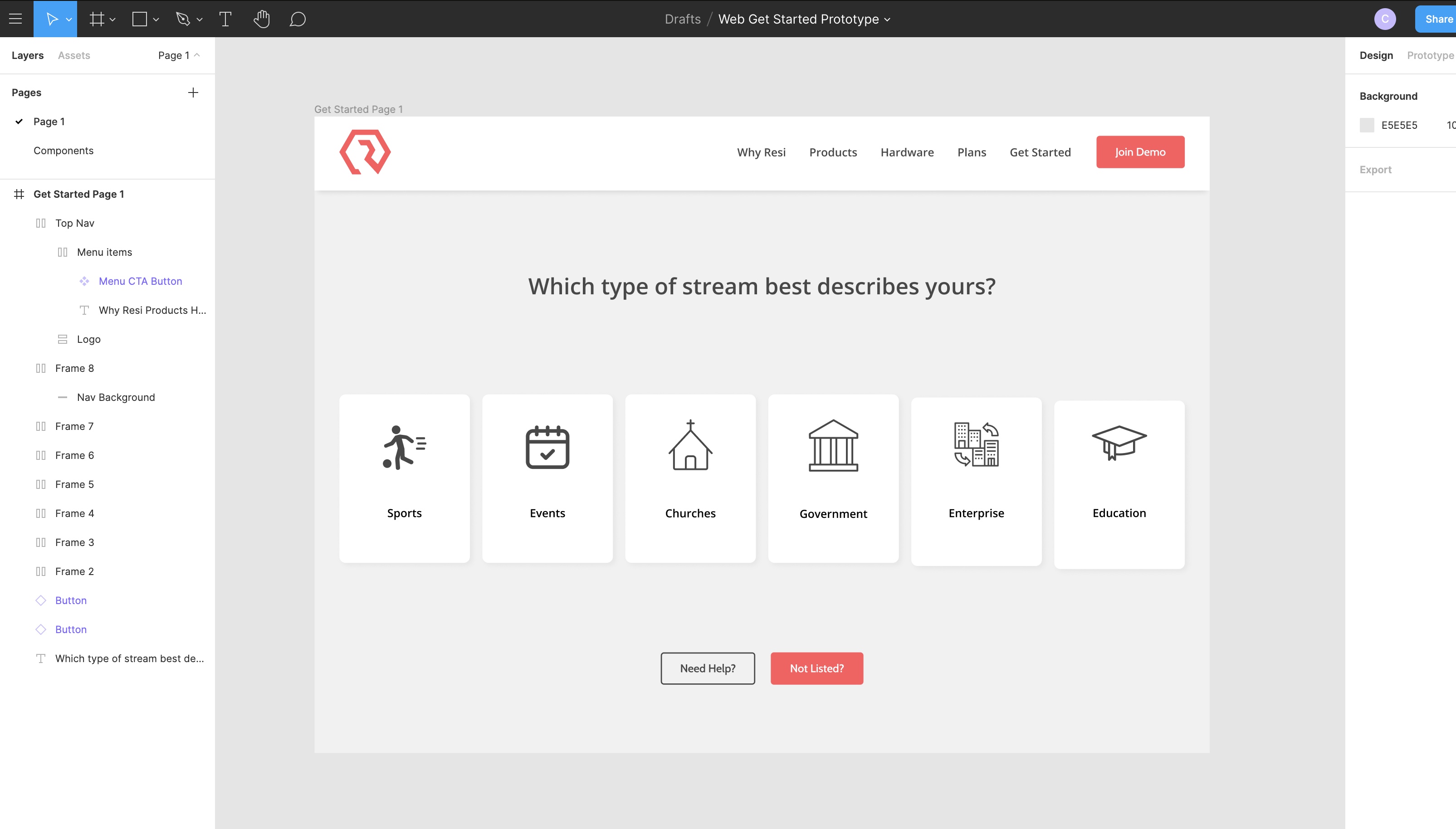
Once we identified the pain points, we put them on paper to discover a solution. The problem that was identified to us during our user journey session review, was that we did not provide enough information on each product and use case during the get started flow. I proposed a solution of adding product videos on each page, and a comparison button that would show users a quick comparison between each product, with use case explanations included in the video as well. The next solution I proposed was completely redesigning the first page of the flow. Before, the first page simply asked the user where they wanted to stream to (web, multisite, both). Most users got confused here unless they were already familiar with church streaming lingo (multisite is not a term used outside of the church world). The solution I proposed was a new starting page that asks users what kind of streaming they want to do first. Then, if they choose church, they see the church language on the next page asking them where they want to stream to (as well as a message saying Resi was designed for churches just like them!) and if they chose a non-church use case, they saw the term "point to point" instead of multisite and had a lot more guidance on what each product is used for during the next few screens.
I tested the prototype on 3 different users. One was a church tech director, a "Jake", persona type. The other was a former event coordinator, middle aged woman, who closely resembled our "Sara" persona. The last was a total streaming outsider, a business owner looking for better ways to stream his conferences. He did not fit a persona, but provider a complete outsiders point of view for testing purposes. The tests went great! During the prototype testing, if a user clicked on the comparison video button, we explained the differences verbally to them (as the video was not ready yet during testing). We also told them verbally that when they clicked "add to cart" they successfully added a product to their cart as our prototype did not have an animation to show them the button was responding. This solution definitely showed us better responses than the previous flow. Users completed the flow in an average of 50 seconds, where the previous flow design took users over 10 minutes on average. When a real user uses an e-commerce flow, there definitely would be an increase over the 50 seconds as someone would take much more time making sure they aren't about to make a bad purchase, but the fact that none of our test users got "stuck" where they didn't know how to continue was great.
The result was a redesigned get started flow that helped users find the right solution for them by default, rather than making users leave the flow to do more research. The test results, as well as the overall impressions from multiple persona types, showed us that the new starting pages and comparison videos really helped the user feel as though they were in the right place. A solution that is tailored to each person's language also showed to be a great improvement, as before we only used church lingo during the flow which alienated all of our non-church website visitors. One of the solutions I initially recommended, which was to get rid of the contact form, was shown to be a mistake as most of the users we asked found it helpful to know they could reach out at any time. So I added the contact form back into every screen in the final design. Although this solution has not been launched on the live website yet, it is great to know that we have come up with a solution to the problem that should increase conversion rates and decrease user abandonment once implemented!


.svg)